Wednesday, December 23, 2009

its my website rough draft idea.


im going to add some flash/motion and make it bubbly and interactive.
problem #1) i dont know flash or motion.
problem #2) what the heck does bubbly mean?

solution #1) learn it.
solution #2) make the options bounce and move around. make it fun.


merry christmas.
hoping you and yours have a great day.
keep it real ya'll. be blessed

Sunday, December 13, 2009

Tuesday, October 6, 2009

http://alexandrefarto.com/

this guys stuff is freaking insane. his pieces on the walls where he chips it away...dang


and then i played around in photoshop. i always wanted to get a graffiti-esque look. i think it
works...

Monday, September 28, 2009

alternative representations

go here.
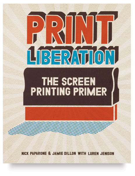
wordsarepictures.co.uk

this is an interesting story.

it all started on a cool friday morn, when i was laying masking tape on a sidewalk in front of my home. nothing extremely out of the ordinary. but the day was full of surprises.

1. the tape.

originally the intent of the masking tape on the sidewalk was to be a stencil for later images. after looking at the contrast between the tape and sidewalk created an interesting form. the fractured line adds a lot to the image as well, although the line is physically continuous, the edges and curves are not smooth. the unintended became welcomed.

2. water

this was interesting just due to the subject matter. anchors are normally found in water, but in this case the water was in the anchor. this became a little messy, the water ended up running under the tape a little bit. sometimes imperfections add to the piece rather than take away.

3. chalk

sidewalk chalk...nuf said.
i miss the stuff

4. rope, rocks, and two shovels

this revolved around the rope (the backbone) of the anchor. i saw the rope sitting in my garage and got to thinking. the rocks came from my mom's garden (it doesnt look the same now...) and the shovels and the rope are my dad's.

there's probably some deep meaning to that i overlooked.

5. matches

we spent forever trying to get those dang matches to light in somewhat the form of a fire.
didnt work. we had a guy waiting to light it. another with the camera. myself covered in gas. still didnt work. but the matches did. it was fun experimenting with the gasoline.
now our street is stained. gas does a lot of things. and it smells bad.

6. water bottles

another appropriate one. water. anchors.

yep

7. leaves

leaves do not always cooperate. it took a while for me to get the form down. just to even see it, it took a while. so i asked someone to look at it from a new perspective. he figured it out. quick. ugh

8. towels.

i dont know what to say.

9. newspaper headlines!

perused the internet for a long time. it does make anysense. at all. but it may create a small story in your head.

10. the t-shirt

mixed experience. i used istock for the first time! i added the hair on the shirt, and the lack of hair in the form of an anchor.

originally i had it planned to get a picture of some hairy-chested old guy and then take out the anchor.
but thats gross.

i couldnt bring myself to it.

Friday, September 25, 2009

on a lighter note, we spoke in class about different directors and the artists that they use.
there was guillermo del toro. "something" mazayaki.
i think wes anderson is good at what he does. and the artwork for his movies are incredible.

there are some new movies coming out that look dope.
a few of em are "where the wild things are" spike jonze looks like he did another masterpiece.
and "the men who stare at goats" looks freaking funny.

inspiration, i would say, is worthy of a blog post.
liquisoft.com-theres a dude named ryan ford that is extremely good at what he does. the type face he created is very well done.
invisiblecreature.com

myspace.com/alexander- the song "i am barabas" is brutal. and necessary.

nalubuff.com that's my friend Spencer's stuff. His paintings blow me away. He was doing work for a auto parts supplier, laying out all their catalogs and designing all of their posters, but now He is working for the Metropolitan Community Colleges, this guy is the real deal.

oh yeah...and he does stuff for technine's label.

and then brandan deason and adam brown are huge at what they do.


this is a design for a youth ministry back home. what would you suggest? i wanted the "live" part to be yellow, but the colors just were not working. i like the deeper red for the "love". its heavy and i think that helps with the weight of the word. ("weight" meaning emphasis and importance. not a bad thing by any means). thanks a bunch

Thursday, September 17, 2009

the font could use some work. but overall im stoked on it.

what do you think?

Wednesday, September 9, 2009

this is how it went down.


Things to remember:
1.these were in order.
2. these are all pre-finished sketches, and the post post is comin' soon.


i get inspired.

Friday, August 28, 2009

STORY
GRAPHIC
-tell all of your friends that things that are complex are not always the best.

a lot of the time we are taught that realism and complexity is the best, most interesting, most successful works. ever.


FALSE

in design we are learning to speed read images and get them stuck in people's minds.
similar to that dang "national american university" song.
gosssssssh.
but for real, in design, complexity is not the goal, it often times gets in the way of the message.
this week in class we started off with a complex story, if you will, that takes a bit more time to explain your story/fairy-tale/romantic story (grossssssss)/bbq (HECK YES!)

so while there was originally a whole bunch of line usage in our images that tell stories, we slowly refined each story in shapes and darkened the contours to make it easy to read.


crap im late for art histroy.
happy friday friends.
GESTALT PSYCHOLOGY

so the general gist of gestalt psychology, is that our mind is smart. our minds can put things together even when the objects do not connect, "that the whole is different than the sum of the parts, (wikipedia answered the phone when i called)"it goes on to talk about the "form-forming" capability of our minds/senses.

the key sub-points of Gestalt Psychology:

emergence-when looking at an image, sometimes it can become difficult to see the object while looking at
the individual parts. but looking at the object as a whole can produce the object differently
than if we had been looking for all of the different parts and adding them together. haha if that
makes any sense

reification-illusory contours, we see, for example, outlines that are not connected physically, but we look between them and see the object at hand...in other words, we connect the points and find the final product

multistability-the tendency of ambiguous perceptual experiences to pop back and forth unstably between two or more alt. interpretations. i didnt phrase that.

invariance-objects recognized despite change in rotation/perspective

pragnanz-(german for "conciseness") we order our experiences in a manner that is regular, orderly, symmetric, and simple. "Gestalt Laws"

Gestalt Laws
a. law of closure
b. law of similarity
c. law of proximity
d. law of symmetry
e. law of continuity
f. law of common fate


on an unrelated note, i just heard the band spoon
for the first time. i liked it.
and wilco is really talented
and the new thrice album is incredible
the glorious unseen record is probably the most real/encouraging thing i have heard lately

Wednesday, August 26, 2009

but theres so much to God that i could never grasp, like the fact He looks for me, He looks forward to me pouring out my heart, and telling Him whats up, and complaining to Him
-and He still listens
and begging Him for things that will be useless in the next months
-and He still listens
and me turning my back on Him
and me coming back when im at my lowest
and yet He still listens.

and this is my prayer-in phillipians, paul says "Because of my chains, most of the brothers in the Lord have been encouraged to speak the word of God more courageously and fearlessly."
i put myself in those chains, but i dont have to be put through that.

i have quit.
forever.

there is encouragement in Chirst.
there is hope.
there is peace.
there is identity.
there is rest.
and there is love.
all in Christ. it is truly Him that satisfies, ya know?


i heard a man with no faith say this, "how much hate must you have (someone who knows there is a heaven and a hell, someone who knows there is a God and a devil) someone who knows of salvation, how much hate must you have for someone to not tell them about it? How much hate must i have to not jump and push you out of the way of an incoming train i told you about but you didnt believe?"

how can we love, and not share what Jesus has done in us?

im working on it.

be blessed friends*


*i never know how to write these, cause im not sure if anyone ever reads them or not. but if you do...sweet.
and if you dont....sweet. but no matter what, believer or not, i mean it.

Friday, August 21, 2009

semiotics

se⋅mi⋅ot⋅ics

–noun (used with a singular verb)
1. the study of signs and symbols as elements of communicative behavior; the analysis of systems of communication, as language, gestures, or clothing.
2. a general theory of signs and symbolism, usually divided into the branches of pragmatics, semantics, and syntactics.


dictionary.com is one smart cookie.

Basically, what it comes down to is this; semiotics is the study of communication. and signs.
This becomes extremely important to designers of all sorts due to the fact that a majority of our viewing group is not as educated in the arts as we are (but they are in business, education, fitness, mathematics, science, journalism, and it goes on and on. and then on some more.).

{that sounds conceited. definitely not intended that way}

but we, as artists and designers, need to find THE way to appropriately communicate and reach our audience. this is a good way for both parties to meet in the middle.

plans.

its kind of bonkers how everything works out.
im still in awe of certain situations.


umm school-wise though...
i am a graphic design major, and i really am starting to get interested in flash/motion animation. i will most likely head that way. as far as print goes, i really like that as well. i will say that my main focus will be internet-based design, and motion/video graphics. at least that is the plan, and in no way is that in concrete.

or signed in blood.

i am a huge fan of screen printing also; i love the way it looks. and i think that there is a lot of potential for interesting works in that area. my brother and i are looking around, scoping out a potential for building our own press right now. it will be small.

{this book helps lay it out. its dope. check it out}


but nothing ever starts massive and stays that way without a foundation.

im stoked.

Wednesday, August 19, 2009